
Project Overview
During this project, we spent 4 weeks redesigning key user flows on The Home Depot’s website.
PROBLEM: Homedepot.com users have trouble completing simple tasks on the site
SOLUTION: Redesign key site user flows to make it easier for users to complete the activities they come to the site to do.
IMPACT: Reduced time required to complete basic flows in order to increase the rate of successful task completion
This project was part of a seven-month UX / UI bootcamp through The University of Texas at Austin.
My team included myself and several classmates.
Surveys
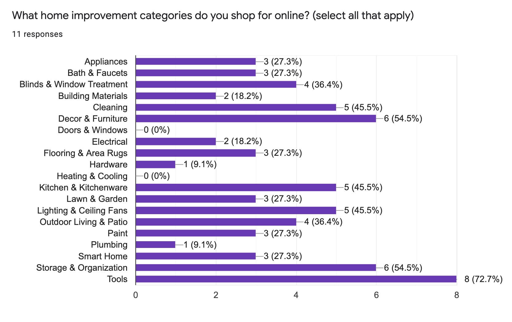
Attitudes towards Home Improvement Survey
In order to find the direction we wanted to take the project, we conducted a survey asking users to share their attitudes and opinions towards home improvement and DIY projects.
We used a Google Forms survey, receiving 13 responses. Our results showed no clear pattern in the types of DIY projects respondents were interested in, but we did learn that 69% of users enjoy doing DIY projects.
Based on these results, we determined that going in the direction of building a microsite on a specific subtopic would not be beneficial. Instead, we decided to focus on flows within the existing website.
Wireframes
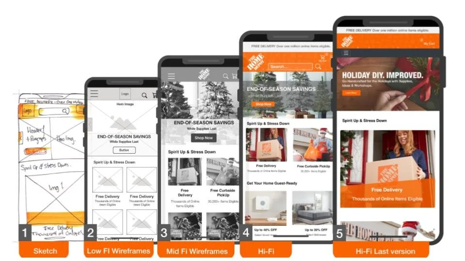
Created wireframes for both desktop and mobile sites
Starting from a sketch and slowly working up to high fidelity through a series of wireframe versions enabled us to begin with a very general idea of what we wanted the UI to look like, then refine each subsequent version until we had our final iteration.
Wireframes were made in Figma. We did several rounds of user testing on working prototypes (made from the wireframes) in order to guide our choices as we refined the product.
User Testing
Mid-Fi Tests
We performed 6 user tests on the mid-fidelity prototype in order to focus in on what still needed the most attention or needed fixed as we refined our product into the high-fidelity version.
A/B Tests
By performing A/B tests, we were able to create less cluttered product cards. We discovered that users preferred more prominent orange buttons, larger font size for pricing, and less cluttered cards. We used this information to create our final product card.
Hi-Fi Tests
We conducted 5 user tests on our high fidelity prototype to guide our final tweaks and changes that produced our final version.
UI Design
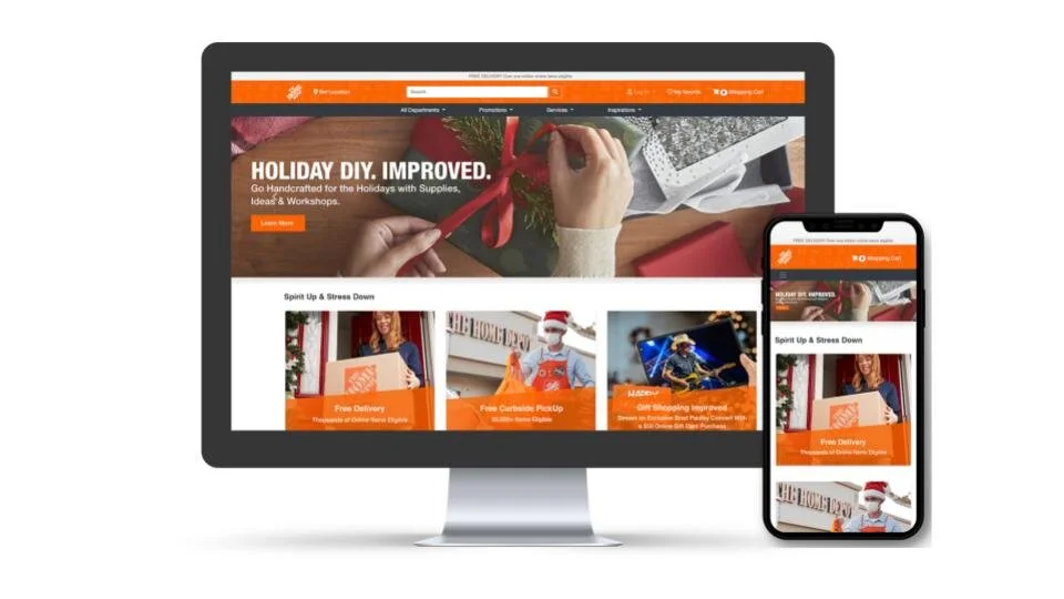
Our final design maintained the look and feel of The Home Depot's existing brand while also improving usability.
Because The Home Depot has a pre-existing style guide, we decided to adhere to that. We focused on making the site less visually overwhelming and more intuitive for users.
We designed for both desktop and mobile. Feedback on the final design showed that we accomplished our goal of helping users accomplish simple tasks more easily.
Final Product - Walkthrough
note: no sound / audio on video
