

USDA Website Redesign
Design Challenge Project
Project Summary:
Information accessibility on the USDA website was problematic.
Users struggled to retrieve information that they were searching for because of the layout and organization of content and navigation. Our team carefully redesigned the site to create an improved user experience.
Identifying the problem
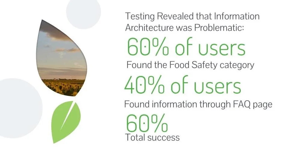
Initial Testing Findings
The user success rate of the initial testing was unsatisfactory, signaling a need to rethink the overall user experience of the site.
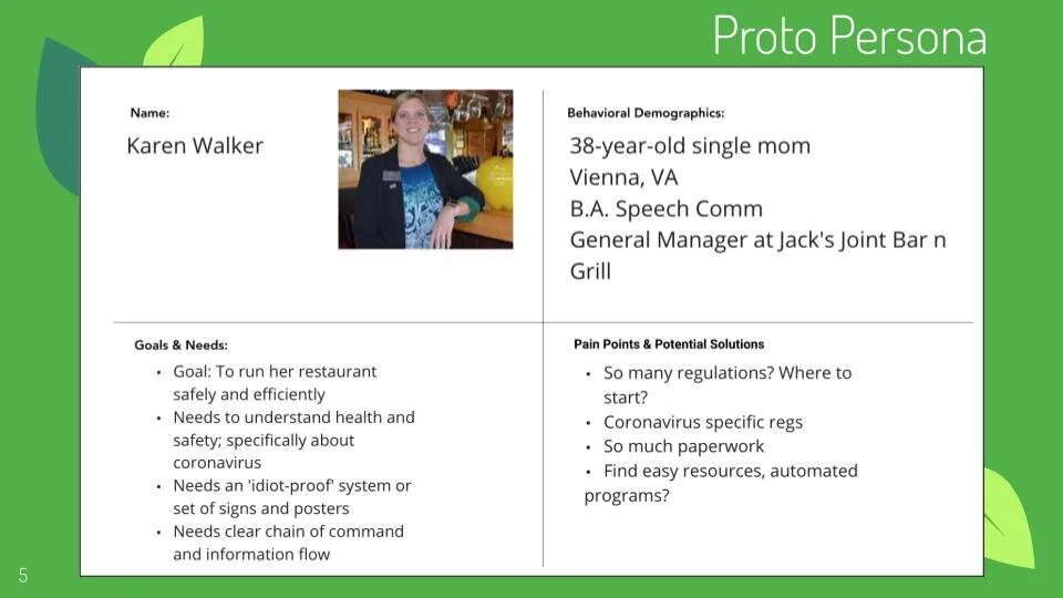
Proto Persona
Information architecture was reconsidered based on the priorities of the user and their typical tasks on the site
The goal was to make it as simple and efficient as possible for the user to access the information they are looking for
We used the context of COVID-19 to come up with a restaurant manager who needs to access the latest information on food safety in relation to Coronavirus.
After examining the pages our proto persona user would need to access, we reorganized the information to be more readily available and simple to understand.
Users being able to easily find answers to their questions was our priority
Addressing Key Pain Points
Information Architecture
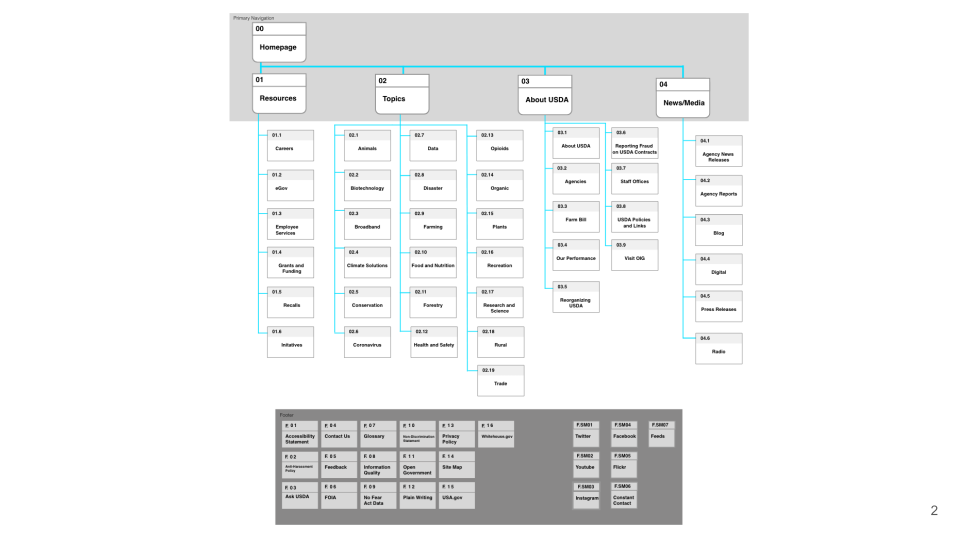
Revised Sitemap
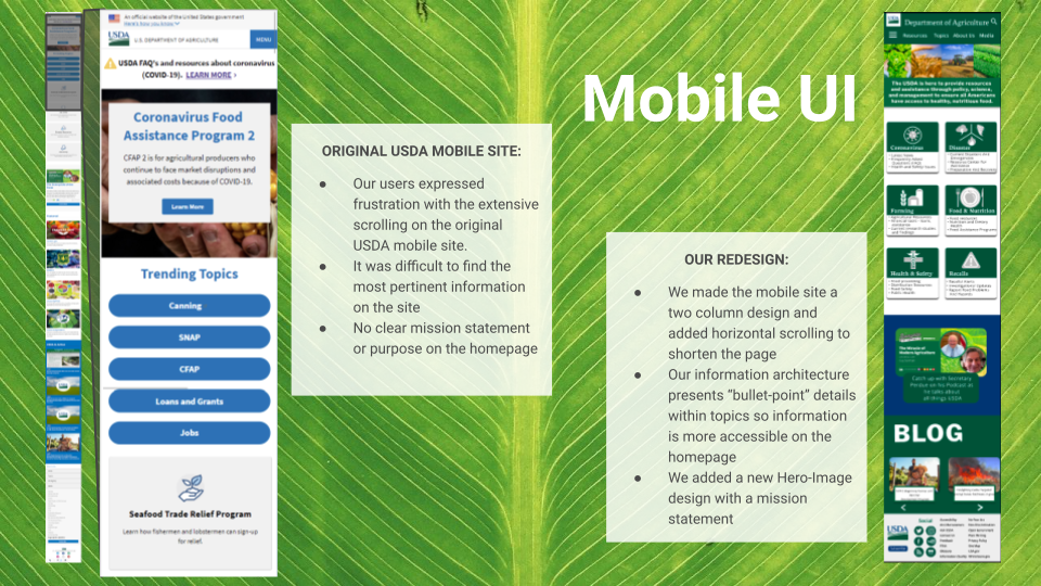
We resolved user pain points due to information overwhelm and failure to locate information by making the layout more scannable, plus making the information more accessible by:
Renaming Certain Categories,
Reorganizing the Site Map,
‘Chunking’ Information into Cards with Scrollability
Desktop Design
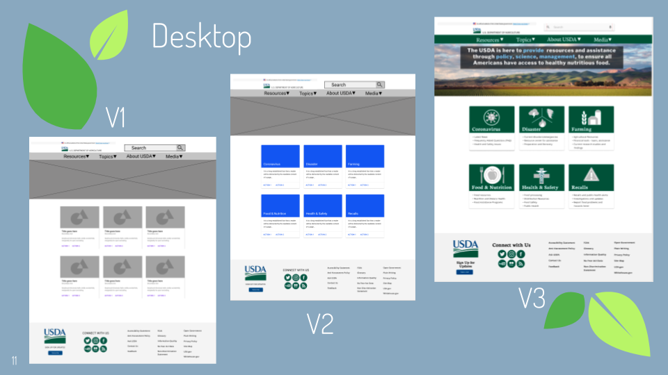
We created three iterations of the desktop site: low-fi, mid-fi, and high-fi. Our final high-fi design was used to create the prototype. All iterations were made in Figma.
Mobile Design
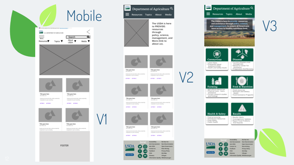
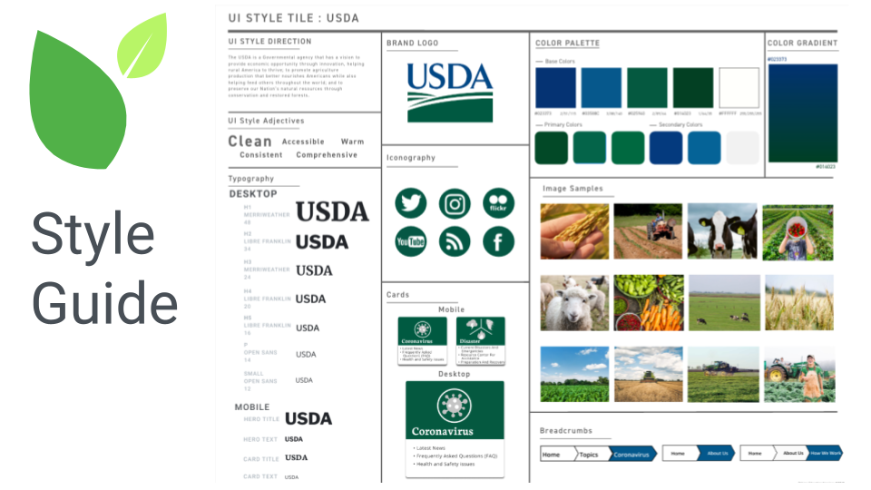
Like with the desktop version, we created low-fi, mid-fi, and high-fi iterations of the mobile site design in Figma. The high-fi design was used to create the prototype.

Redesigned Navigation Walkthrough
note: video is without audio
User Testing
We conducted user testing on our final prototype to assess how well we had done at improving access to information and simplifying navigation.
Like our initial user tests on the original site, we measured the time taken and completion rate of four basic tasks.